Have you ever wondered why food commercials often feature warm, vibrant red and yellow tones, or why real estate ads lean towards neutral, sophisticated shades of blue? It's not a coincidence. It's all part of professional TV commercial color palette standards and artistry. This article will help you explore the fascinating world of color and how brands are using it to captivate consumers.
What is color in a TV commercial? Why is it so important?
In the process of producing commercials, the color grading stage is often likened to the final "makeup" step that transforms a raw film into a work of art. The colors in a TV commercial go beyond simply making the image look good; they also play strategic roles:
- Guiding emotions: Colors have the ability to activate the human emotional nervous system. Warm colors create a sense of closeness, while cool colors convey trust or professionalism.
- Brand positioning: The colors in the TV commercial must be consistent with the brand identity so that customers can recognize the brand at a glance.
- Focus your attention: By adjusting contrast and saturation, filmmakers can direct the viewer's eye to the product amidst a complex background.
Current common technical standards for TV commercial color
Before discussing the artistic aspects, we need to understand the technical standards to ensure the best image display on all devices, from TVs and smartphones to outdoor LED screens.
Rec. 709 standard
This is the most common color standard for high-definition television (HDTV). If your TV commercial is broadcast on channels like VTV or HTV, then Rec. 709 is the standard you need to remember. It ensures that colors are not washed out, not overexposed, and are displayed as accurately as possible to the human eye.
Rec. 2020 (UHD/4K) standard
With the explosion of 4K and 8K displays, Rec. 2020 allows for a much wider color gamut than Rec. 709. TV commercials with this standard will have incredibly vibrant, deep, and lifelike colors.
High Dynamic Range (HDR)
HDR enhances the contrast between the darkest and brightest areas of an image. In TV commercials for high-end cars or phones, HDR makes metallic details sparkle more, shadows deeper, and creates a luxurious and sophisticated look.
The art of color coordination in TV commercials.
Each color carries its own psychological meaning. Directors of photography (DOPs) often apply the following color schemes to create an appealing TV commercial.
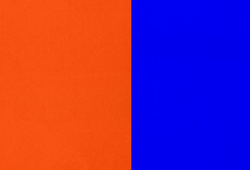
Complementary color scheme
This is how two colors opposite each other on the color wheel are used (for example, orange and blue). The "Teal and Orange" trend is a prime example in TV commercial color schemes. Orange represents skin tone and warmth, while blue adds depth to the scene. This contrast helps the subject stand out completely from the background.
Analogous color scheme
Use groups of colors that are next to each other (e.g., yellow, orange, red). This color combination is often used in food or home-themed TV commercials because it creates a harmonious, soothing feeling and doesn't strain the viewer's eyes.
Monochromatic color scheme
Using only different shades of a single color. This style is extremely selective but creates a very strong visual effect, often used for high-end fashion products or abstract, artistic TV commercials.
The psychological significance of color tones in TV commercials.
Let's take a look at how brands "exploit" color psychology to reach you:
- Red: It stimulates the heart rate, creates a feeling of appetite and urgency. Often seen in fast-food TV commercials (KFC, Coca-Cola) or discount promotions.
- Blue: It conveys a sense of trust, security, and professionalism. This is the dominant color in TV commercials for banks, insurance companies, and technology companies (Samsung, Intel).
- Green: Represents nature, health, and freshness. Suitable for organic product lines, health supplements, or natural cosmetics.
- Yellow: It evokes feelings of happiness, optimism, and creativity. Often used for products aimed at children or services that bring joy.
- Black & Gold: A symbol of power, luxury, and mystery. Luxury cars, watches, and high-end perfumes cannot do without this perfect pairing.
Professional TVC color correction process at Production House
To achieve a TV commercial with colors that everyone will love, the color grading process is usually divided into two main stages:
Step 1: Color Correction
This step involves bringing the colors back to a balanced state. The technician will adjust the white balance, exposure, and contrast to make the image look as natural as possible, correcting any lighting errors that occurred during filming.
Step 2: Color Grading (Defining the color style)
This is where the artistry shines. At this stage, experts will apply color layers (Look-up Tables – LUTs) or fine-tune individual color areas to create the "atmosphere" for the film. Do you want the TVC to have a vintage, modern, or vibrant feel? It all depends on this step.
Common mistakes when using color in TV commercials.
Whether you're a business that manufactures its own products or outsources production, be aware of the following mistakes to avoid damaging your brand image:
- Uneven colors: There is a noticeable color discrepancy between one scene and another, which makes the viewer feel uncomfortable and gives the scene a lack of professionalism.
- Overuse of color: Overly vibrant color adjustments can make the subject look like an "alien" or cause the loss of natural detail in the product.
- Brand color discrepancies: The red color of the logo being changed to an orange-red in the TV commercial is a serious brand identity mistake.
- Don't pay attention to the display device: The colors look great on the video editor's computer but appear dull and gray when shown on the client's TV or phone.
Right Media – The company that masters the art of color in complete TVC packages.
If you're looking for a company that can transform your advertising ideas into stunning, professional videos, Right Media This is the top choice.

At Right Media, we consider TVC color to be the soul of our marketing campaigns. We are committed to providing our clients with:
- Dedication brings complete peace of mind: We don't just adjust colors for aesthetics; we adjust colors to "sell." Right Media's post-production team always engages in thorough discussions with businesses to understand their brand identity, ensuring that every frame delivers reliable quality.
- Competitive and transparent pricing: Right Media owns a state-of-the-art color suite equipped with international-standard equipment, yet offers extremely competitive prices. We provide comprehensive TV commercial production packages with transparent pricing from pre-production to post-production, with no hidden costs.
- Excellent support and expert advice: You don't need to be a color expert. Right Media's consulting team will help you choose the most suitable color palette for your industry and communication goals. We provide enthusiastic support from the initial idea stage to the successful broadcast of the final product.
- Advanced color correction technology: We use world-leading color grading software such as DaVinci Resolve combined with specialized color calibration monitors, ensuring that the TVC colors are displayed 100% accurately across all advertising platforms.
The future of TV commercial color: Which trends will prevail?
In the coming years, TV commercial color trends will shift in two main directions:
- Neo-Realism: The colors are natural and rustic, but enhanced with HDR technology to create the most immersive experience for the viewer.
- Minimalism: Using neutral, minimalist color palettes that are incredibly sophisticated, the focus is entirely on the product and the message.
The color scheme of a TV commercial is the invisible thread connecting the customer's heart to the brand. Understanding and correctly applying color standards not only makes your video more visually appealing but also significantly increases its persuasive power and closing potential. If you want a TV commercial with sophisticated, elegant, and captivating colors, don't hesitate to contact us. Right MediaWe are always ready to work with you to turn every second of your footage into a precious moment.